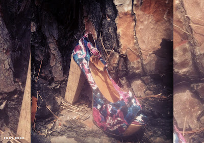
See what I mean? There's too many random things going on - snakeskin, neon, tie dye - combined with downright BAD (and cheap?) styling and no actual vibe or theme to speak of. In some of the shots you can't even see the shoes when, OBVIOUSLY, they should be the main feature?!
Perhaps it's unfair to judge this lookbook too harshly since Jeffrey Campbell are, after all, a shoe brand, but in that case why waste time and effort on something so mediocre when they could have let the shoes speak for themselves as they often do. They're established enough to know better. It's a shame.
What do you think, do you guys agree or disagree?


1 comment:
Those jeffrey campbell shoes is amazing! I really like this whole look :)
Post a Comment